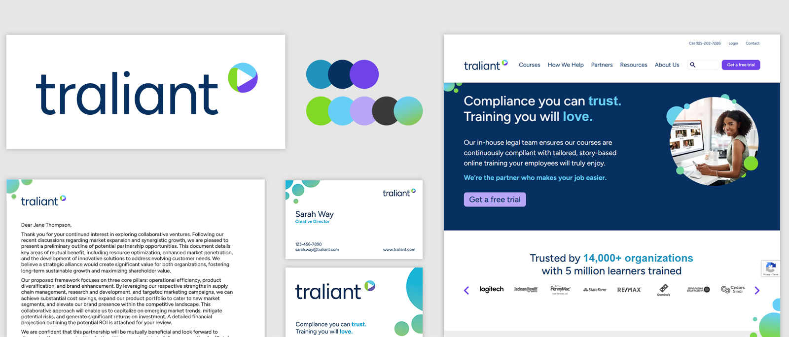
Traliant's Visual Identity

Project Overview
Traliant is a leading provider of online compliance training. Their interactive, story‑based courses, developed in conjunction with an in‑house legal team, are designed to resonate with employees to promote positive workplace cultures.
Services
  • Visual identity design and development
  • Brand guidelines
  • Website design
  • Design templates
An brief visual overview of Traliant's brand visual redesign including the logo, color palette, website, stationary, and business cards.
My approach
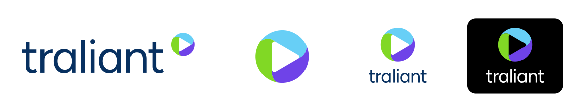
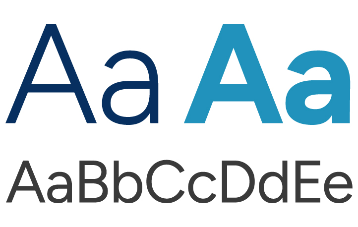
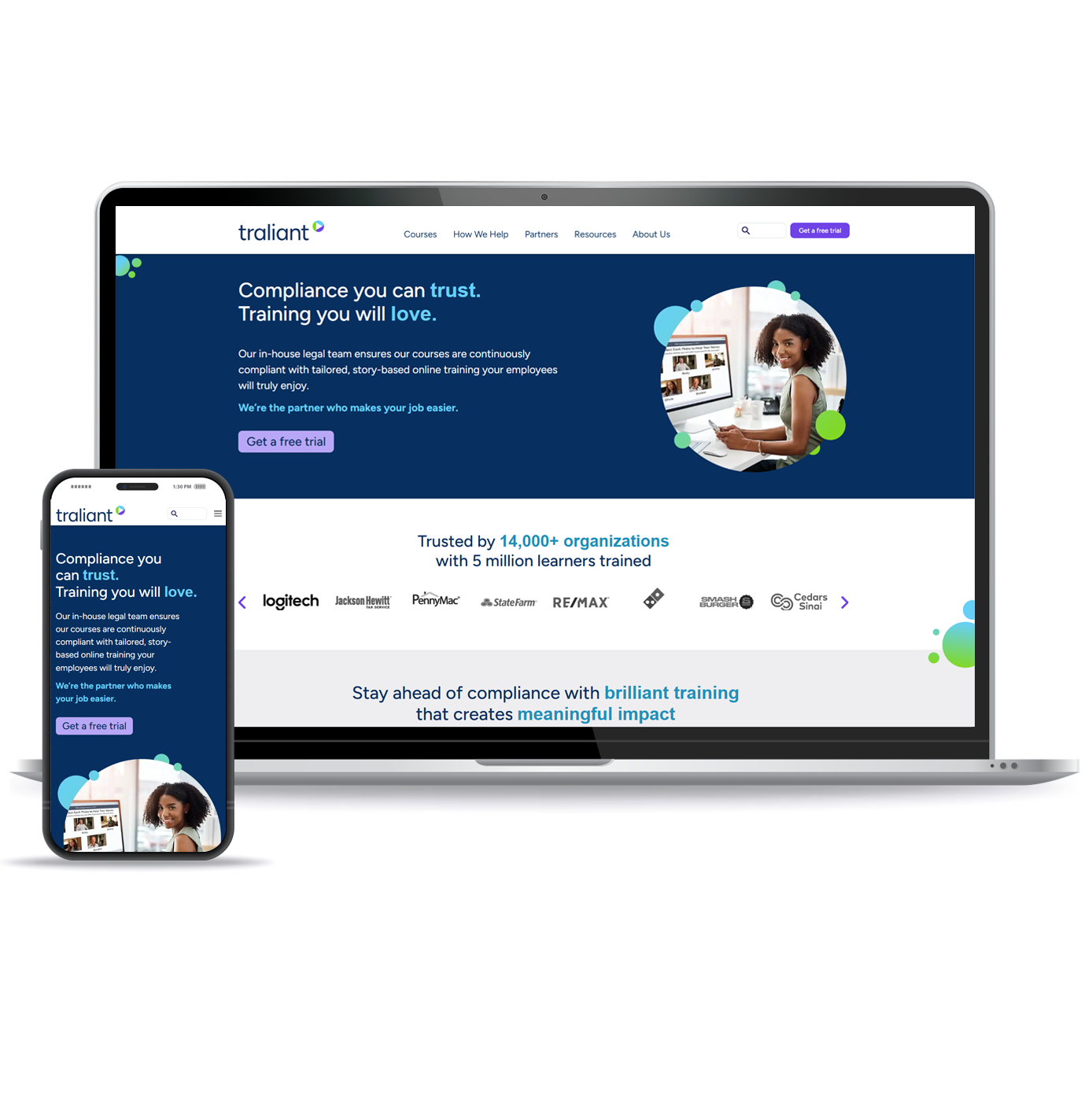
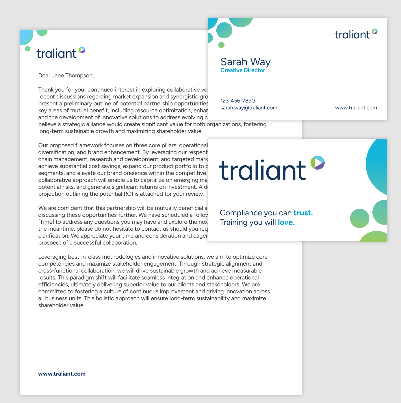
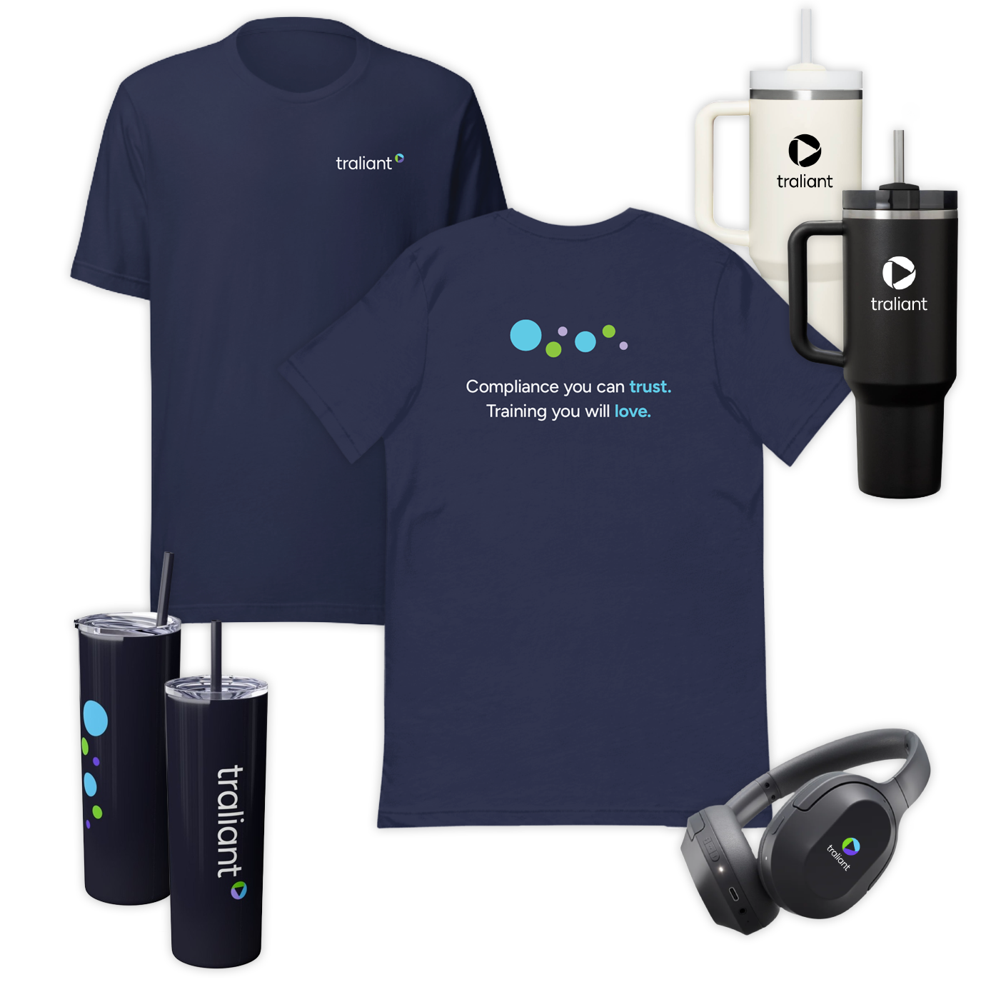
Traliant's goal was to create a brand identity as engaging and approachable as their compliance training. Focusing on a primarily female audience, they envisioned a modern, professional aesthetic that felt friendly and relatable, fostering a welcoming and human‑centered brand experience.

Their tagline, "Compliance you can trust. Training you will love" (often reinforced with "A partner you need"), perfectly captures this warm, trustworthy approach, reflecting key themes that emerged from team discussions: trust, dependability, growth, creativity, and innovation. My design intent was to ensure that the colors, fonts, and graphic elements visually reinforced these themes.
Four variations of Traliant's logo including the full main logo which is horizontally oriented with text and a symbol, the symbol alone, a square version with the symbol above the wordmark, and a reverse color version of the logo
Logo development
When I began the Traliant rebrand, the team wanted a symbol that truly represented their core tenets. I started with a circle — a shape that speaks to concepts like constancy, connection and growth while resonating with their key female audience. The initial pillars were compliance and training, represented in early iterations. As the brand strategy evolved, a third pillar of partnership was added.

The final design incorporated three interconnected elements — compliance, training and partnership, which visually demonstrate their interdependence. These three functions are mutually dependent and incomplete without each other. This understanding shaped the final emblem, a symbol of Traliant's integrated approach, which also subtly nods to the high-quality videos at the center of their training.

The Traliant team emphasized approachability as a cornerstone of their new visual identity. The wordmark's clean, geometric forms create a sense of modern professionalism, while the use of lowercase lettering softens the overall impression, resulting in a friendly and inviting appearance.
The evolution of the symbol design development
Brand colors
Traliant's color palette: the main colors are teal, navy and purple with secondary colors of lime green, cyan, light purple, dark gray and a gradient of cyan to lime green.
Traliant's vibrant color palette is built on the principles of approachability, interest, and innovation.

Blues (Navy, Teal, Cyan): These shades convey trust, dependability, and a sense of clarity.

Purples: From deep to lighter tones, the purples evoke creativity and a forward-thinking vision.

Lime Green: Used as an accent, this energetic hue represents growth and innovation.
Typography
Traliant's typography using Figtree Regular and Figtree Bold
To complement their new, human-centered direction, Traliant wanted a modern, casual font to emphasize the accessible and relatable nature of their course content and design.

Figtree is a clean, geometric font that strikes the perfect balance between approachability and professionalism. Its friendly and minimalistic letterforms convey their messages with both clarity and a touch of lightheartedness.